Due to the graciousness of a close friend, I was given the opportunity to work on a regional project for Monarch Dental. The regional dental hygiene mentor of Monarch Dental needed a card designed that would have information on the front and back that could be shown to their customers who received periodontal measurements during their check ups. The card needed to fit inside the pockets of the scrubs that the dental hygienists wore and would be laminated for durability. She wanted one side of the card to look cartoon-ish and the other to look scientific. The main line drawings for the project were created in Adobe Illustrator and then finished with color and touch-ups in Adobe Photoshop. I used a semi-heavy weight paper for added durability and slight texture to give the print some character. All of the text and layout of the card were added in Adobe InDesign, as well as the final print setup for the project. The two bottom photos are of the finished product. These cards will be mass produced and eventually sent to Monarch Dental offices across the country. This was my first freelance design project and I learned so much about design as a freelance artist. This was an eye-opening experience. The clients were very pleased with the finished product.
The one project that became a monster were the countless game day promotional fliers that I created in my six months as an intern with the Texas Rangers Baseball Club. The request for more never seemed to end. With no exaggeration I probably created at least fifty of these or better. The photos were all enhanced and cut out in Photoshop while the overall design and layout of these fliers were created in InDesign. It all started with an email with a text file of everything they wanted the flier to include (which normally went through three or four revisions before the final print) and I was free to design the flier however I choose with a few minor guidelines. These guidelines normally were what player to use, which typeface to use and what logos to include, the rest was up to me. These five are just a glimpse of the many I created. I tried as best I could to be diverse for each flier depending on what it was for. Most of the school fliers were the same though, just different players pictures were used.
One of my projects as an intern with the Texas Rangers Baseball Club was to create autograph cards that would go to print and be used by players and staff to sign autographs for fans at different Academy Sports stores across the metroplex. The first step was to design a uniform template that could easily be transferred from player to player. After that was complete, the only thing I had to change for each card was the picture and the players name. I was pretty much free to make them however I chose and got to choose whatever picture I felt best fit for each player and their card. I stuck to a simple baseball card type design with a vertical bar on the right side with a blue and white gradient that each name would go in. Then I used curves in Photoshop to enhance the crispness of each photo. These went to print and thousands of prints were made for about twenty plus cards that I designed.
During my internship, I created many many many fliers and the occasional page for a game day program. The top picture is of a page I created for a game day program for one of the Dallas Stars games. The bottom picture is a flier that was mailed out to Stars fans. Both were created using Adobe Photoshop and Adobe InDesign.
This project comes from a layout class I took back in 2008. We were given text and picture files and instructed to design a newsletter that was both creative and visually appealing. We were also instructed to use a color theme and could only use two typefaces. We were allowed to place the pictures and type however we chose. The main idea of the project was more about the layout anyway. I used a san-serif font and wanted to use curves and lines that are similar to what one may see when viewing architecture (after all this is an architecture newsletter). These pictures are of the print versions that would go to print. The top picture has the back page (left) and the front page (right) while the bottom picture has the inside pages (as would be seen when opened). I love the curve design that runs through both inside pages and how the colors swap. It's very eye-catching. I got an "A" on this project. I really enjoy typography and layout projects. Most people think they are boring.
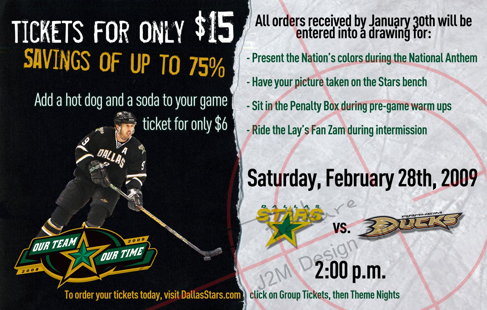
While I was a graphics intern with the Texas Rangers Baseball Club (yes that's a Dallas Stars postcard, Tom Hicks owned both teams at the time), I learned many things about what it is to be a graphic designer. One of which is the editing and revision process. What you think is the best work you've created or the best solution for the concept of the project, someone else may have other ideas and the final product may not be ultimately up to you. This isn't necessarily a bad thing but it can get frustrating if you have to make change after change, however, this is part of the job. The above was the final product (not my favorite of the six designs I had made) that was mailed out all across the Dallas/Ft. Worth Metroplex to inform Dallas Stars fans of this promotion for that specific game. The black and green backgrounds seen were actually pieces of paper I had ripped and scanned into the computer and enhanced with Photoshop. I used photos of ice for the right side of the (top) card and messed with different texture ideas to place over the left (second card) side of the card. The third and fourth picture is one of the many ideas for the card I submitted for the final product. I personally liked the first and fourth pics for the card.
This project was something I heard about when watching a NASCAR race one March day in 2010. For fun I thought I would design a car for the Toyota Sponsifier contest. I entered this car into the contest but there were some issues with the competition and how the voting was done so they started all over. I never bothered to re-enter into the contest since I was a little bitter about them entering their own cars into the contest despite it being against the rules. I used my company logo, slogan and color scheme for the car. This was the end result. After seeing some of the other entries, I'm pretty sure I could have made it at least into the top ten. The top picture shows the car I initially entered into the contest. The bottom is what I had leftover from Photoshop. There are a few differences in the two. I personally liked the top car the best.